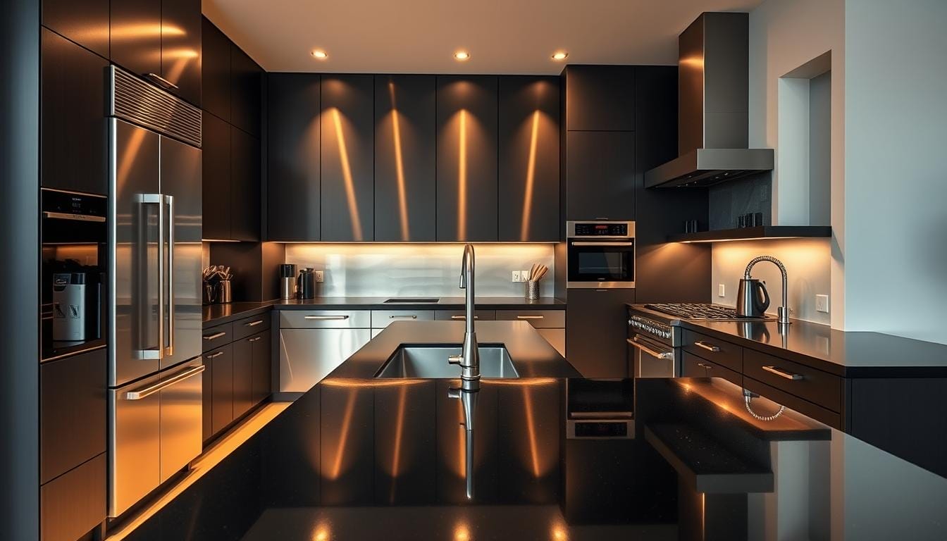
Can a kitchen use shiny metal and dark units together and still feel warm? That question challenges the old rule that matching finishes must be identical.
This guide shows how to blend metal’s light-reflecting presence with darker finishes to create a high-contrast, modern look that feels inviting rather than heavy.
Metal surfaces bring a professional baseline: they reflect light, expand perceived space, and signal durability. Dark units act as anchors—best used on a focal wall like the range or fridge—to add depth and clarity.
Start small: swap in a matte faucet, new hardware, or stools to preview the contrast before buying full packages. Think in layers: units, cabinetry, counters, lighting, and hardware should work together.
Practical tip: assess natural light and traffic so finishes support daily use. Small accents can bridge finishes and prepare a room for darker elements without compromising longevity.
Why this kitchen combo works right now
When reflective finishes meet dark units, the result can be an airy room with a defined focal point. Reflective metal bounces ambient and task light, making compact kitchen plans feel larger and more open.
Practical advantages:
- Reflective surfaces boost brightness and maintain a professional style.
- Dark units provide crisp contrast and hide fingerprints better in busy home kitchens.
- The pairing adapts across design types—from transitional to contemporary—because metal reads neutral while darker tones add edge.
Consider natural light before your final choice. Rooms with limited daylight benefit most from reflective trims and hoods. Use darker units to anchor a range wall or refrigeration zone, and rely on metal hardware to keep the composition lively.
For practical guidance and sourcing ideas, review options for matching finishes and maintenance at stainless steel and black appliance pairings.
Design foundations: creating balance with light, contrast, and texture
Plan the layout around a single focal appliance. Choose the range, hood, or refrigerator first and arrange sightlines so reflective elements catch natural and task light. This approach helps the room feel organized and purposeful.
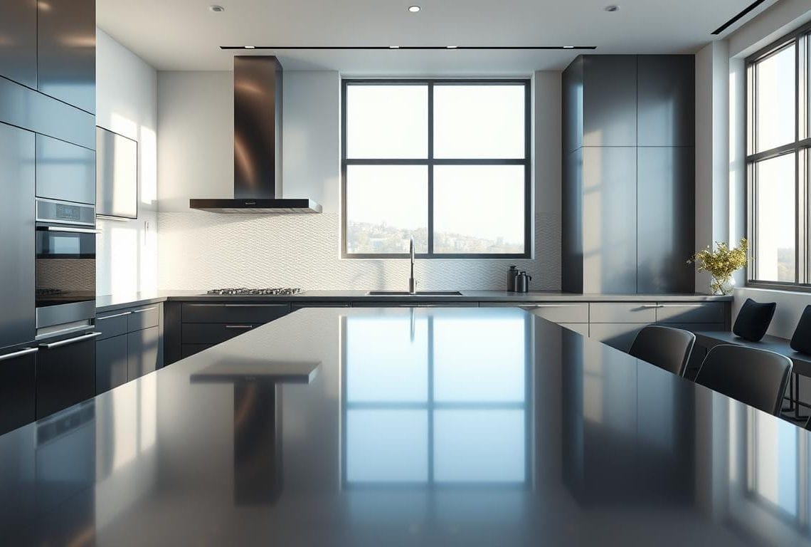
Use layered lighting to keep dark finishes lively. Combine ceiling ambient, under‑cabinet task, and small accent fixtures. Reflective trim amplifies these layers and opens the space, while the darker unit reads as a modern anchor.
Mind sightlines and material placement. Place the brighter metal where you want visual lift—hoods, dishwasher fronts, or trim. Keep the darker unit on the primary activity wall so contrast feels intentional.
- Balance textures: brushed metal paired with matte fronts and subtle grain counters limits glare and feels refined.
- Preserve functional triangles: metal near prep zones improves visibility and hygiene cues.
- Calibrate contrast: one dominant dark block works better than many small dark spots.
Final tip: let reflective finishes carry the perimeter and let the darker appliance statement sit at the heart of the plan. This simple hierarchy maintains clarity and lasting design cohesion.
Cabinetry and countertops that make the look sing
The right cabinets and counters turn contrast into harmony. Avoid very bright doors directly next to darker appliance faces; the visual jump can feel harsh. Instead, choose mid‑to‑dark cabinetry tones that soften edges and read intentional.
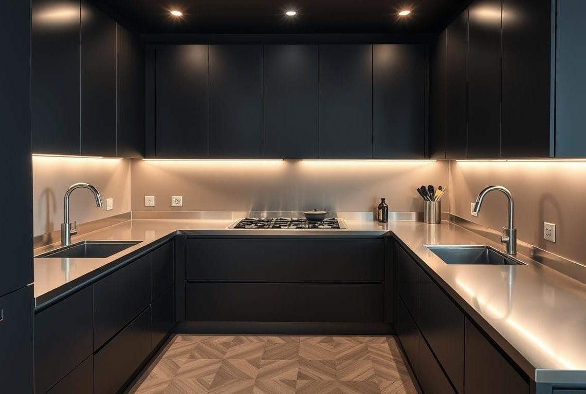
Lift the palette with light countertops: pale marble, light quartz, pale concrete, or light wood tops add air and balance darker fronts. Reflective tops—such as a stainless steel strip or polished stone—near prep zones keep the room feeling open.
- Prevent jarring transitions: pair darker cabinet runs with light counters.
- Use wood accents—open shelves or an island top—for warmth and texture.
- Prefer simple door styles (flat‑panel or Shaker) in a satin or matte finish to pair cleanly with appliance faces.
- Match slim, eased edge profiles for a modern, cohesive finish and consistent lighting color temperature so neutrals stay crisp.
Practical note: for heavy‑use zones, pick durable light surfaces with subtle veining to hide crumbs while preserving a professional look. This strategy keeps the kitchen functional and visually balanced.
stainless steel with black appliances
Choose a simple rule set early to keep contrasting finishes cohesive and calm. A clear plan prevents accidental mismatches and saves money.

Simple pairing rules for a cohesive finish palette
Limit the palette: pick two dominant finishes—stainless steel appliances and a dark metal—and one accent metal like brass or brushed nickel. This creates a unified look without clutter.
Mixing finishes without mismatching brands
Confirm finish names and request samples. Test swatches under your kitchen lights so tones read the same in place.
- Use consistent sheens: brushed pieces pair best with matte dark faces.
- Keep stainless as the unifier: hoods, trims, or a dishwasher help the room read coordinated.
- If counters are light, echo that brightness in a backsplash or shelves to balance depth.
Small accents that bridge the tones
Introduce dark elements in small doses first: matte faucets, pulls, stools, and lighting. These items tie darker faces to steel appliances and light countertops without a full remodel.
Know your finishes: stainless, black, and the truth about black stainless
Understanding finish types prevents costly mistakes and keeps your kitchen looking built-to-last.
Stainless steel earns praise for durability and hygiene cues. It resists rust and stains, and many models include fingerprint-resistant coatings that make upkeep easier.
Its light-reflecting quality brightens tight or shaded prep zones. That helps safety and productivity around sinks and ranges.
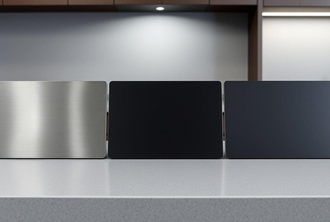
True dark finishes differ from coated options. Standard coated black stainless is typically a thin surface film over metal. Scratches often reveal the bright base metal, creating stark blemishes that are hard to fix.
Bosch and a few brands bake color into the metal, improving scratch resistance compared to simple coatings. Still, heavy-use homes should prioritize tested durability.
- Durability: pick proven finishes for long life and easier repair.
- Maintenance: request samples and do a scratch test when possible.
- Decision: if a dark look is essential, choose true black finishes from reputable makers—or stick to classic stainless for longevity.
Smarter alternatives if you’re debating black stainless
Choosing a durable, attractive finish is as much about care as it is about looks.
Homeowners who worry about scratching should compare long‑term options before buying. Recent market data shows coated dark finishes fell from about 20–30% of packages to under 1% due to repair and wear issues.
Classic stainless and fingerprint‑resistant variants
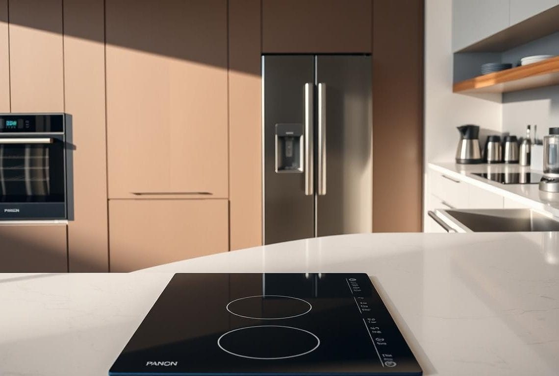
Classic stainless steel appliances remain a safe, long‑horizon choice. Smudge‑resistant models reduce visible prints and match across brands easily.
They offer broad availability and simple upkeep—use mild cleaners and microfiber cloths for best results.
True matte, gloss black, and brand options
For a dark face without thin coatings, consider true matte or gloss lines from Café, BlueStar, Fisher & Paykel, and Wolf.
Bosch’s baked‑in approach improves scratch resistance compared to surface films—inspect samples in store before finalizing your choice.
Statement finishes: white, custom colors, and panel‑ready looks
White is back—brands like Café add trim options that create crisp contrast against darker cabinets.
For bold color, explore BlueStar’s 1,000+ hues, True, La Cornue, and Viking’s designer programs.
Panel‑ready units from Sub‑Zero, Miele, Bosch, and Thermador let cabinetry lead the style while preserving professional performance.
- Recommended: pick classic stainless steel appliances or a true black line for durability.
- Try: white or custom colors if you want a distinctive kitchen statement.
- Check: samples under your lighting to confirm the final finish choice suits daily use.
Color and material pairings that elevate your space
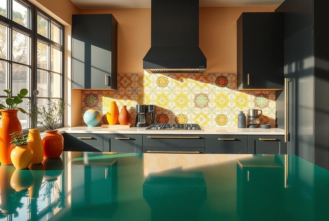
Strategic color pops bring energy without overwhelming darker appliance faces. A single saturated accent can lift a moody palette and define sightlines in a busy kitchen.
Bright accent colors that pop against dark units
Less is more: choose one or two vivid notes—red, lime, gold, or silver—in stools, pendants, or small gadgets. These touches highlight the focal wall and avoid visual clutter.
- Use restrained brights in seating or a pendant to energize darker appliance faces.
- Pair darker fronts with light countertops and backsplashes—marble‑veined quartz or pale concrete keep the room airy.
- Introduce warm wood shelves or a butcher‑block top to soften steel planes and add a homey feel.
- Balance metal accents: brass or brushed nickel ties reflected light to darker silhouettes.
- Keep bulb color consistent so bright hues and neutrals read true under the same light.
Test samples in place before committing. A subtle repeated note into adjoining rooms makes the whole design read intentional and cohesive.
Common pitfalls to avoid in this finish combo
Durability often fails when style choices outpace practical use in busy kitchens. Homeowners and pros must pick finishes that last for daily wear, not just make a statement.
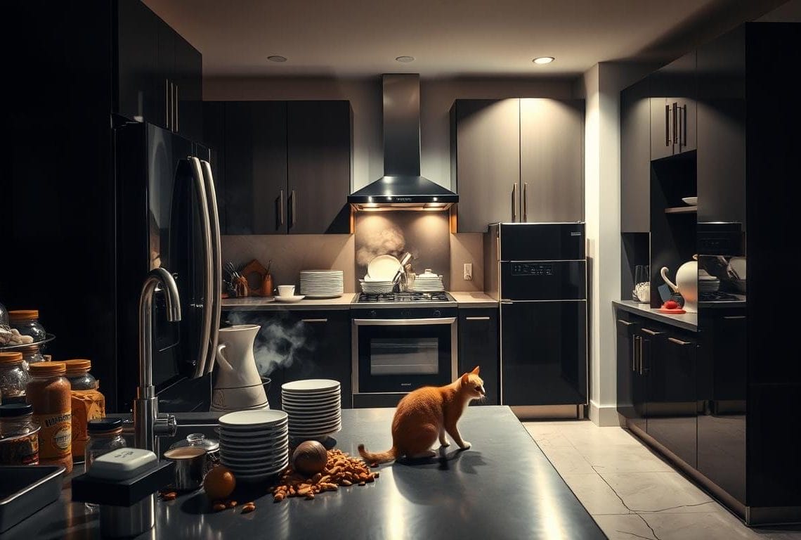
Top mistakes date a house quickly and add replacement expense. Pay attention to where dark coated surfaces will get the most use, and plan replacements before you commit.
- Avoid relying on coated dark surfaces in heavy-use areas: once the surface scratches, the bright base metal shows and repair options are limited.
- Don’t mix coated finishes from different brands: tones vary and create a mismatched run that dates the kitchen.
- Skip bright doors right next to dark faces: high-contrast edges feel harsh—use light countertops to soften transitions.
- Don’t stack too many trends: multiple statement finishes compete and shorten the useful life of the design.
- Plan lighting early: under-lighting dark blocks creates gloomy prep areas—add task and ambient layers.
- Future-proof the house: choose widely available finishes to avoid mismatched replacements if a line is discontinued.
- Balance dark wood and dark counters: too much darkness near appliance faces makes work zones feel cramped—introduce reflective surfaces and lighter tops.
- Always sample in place: check cabinetry, countertops, and finishes under real light to catch hue shifts before installation.
Final tip: prioritize long-term performance over fleeting looks. A neutral, proven finish in key areas keeps functionality high and resale risk low.
Budgeting your finish choices for maximum impact
Prioritize performance anchors: pick where to spend first — ranges and refrigeration dominate function and sightlines in a house. Splurging here gives long-term value and makes a kitchen feel deliberately designed.

High / medium / value paths for appliances and surfaces
Value: dependable classic stainless sets and entry counters. They match easily across brands and keep replacement simple in a home.
Mid‑tier: smudge-resistant stainless variants and selective matte accents. These reduce upkeep and lift perceived quality without premium price tags.
High‑end: panel-ready refrigeration and statement ranges from Café, BlueStar, Fisher & Paykel, or Wolf. Expect higher cost but a seamless, bespoke area.
When to splurge on ranges, refrigeration, and panels
Invest in the items you use daily — a reliable range and fridge improve cooking and resale. Save on secondary gear like dishwashers or microwaves by matching classic finishes and handles.
- Allocate budget to countertops that balance finish choices; durable light tops can elevate the entire kitchen without premium slabs.
- Consider panel-ready options only if the house benefits from integrated cabinetry — include cabinet fabrication costs in total ownership.
- Use wood accents and upgraded lighting to add warmth cheaply. Evaluate lifecycle costs — cleaning time and replacement risk — before finalizing finish choices.
Your next steps to a timeless, high-contrast kitchen
Start with a short audit of the space: note daylight, sightlines, and high-use zones so kitchen design places steel where it brightens and anchors darker appliances where contrast adds value.
Shortlist finishes that last — classic stainless or true matte black — and gather samples for an in-home lighting test. Black stainless has fallen under 1% of packages due to scratch issues; choose longevity.
Build a simple materials board: cabinet door, countertop chip, hardware, two finish swatches. Decide your statement area — range wall, island, or refrigeration — and keep the rest restrained.
Repeat one accent color and rely on light countertops and reflections for lift. Map purchases for parts and service, schedule lighting upgrades, and finalize choices that make daily cooking an easier, longer-lasting experience.
Need cabinet color ideas? See practical pairings at cabinet color ideas to complete your house plan.
